


Contact us
If you’re ready to upgrade your online presence, contact Let’s Nurture, your trusted website designer in Burlington. We build mobile-first websites that load fast, look clean, and help you convert more customers.

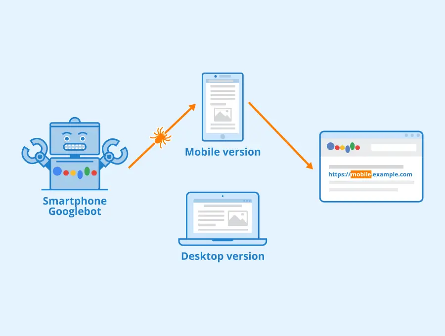
A website designer in Burlington starts every project with one question: “How will this look and work on a phone?”
Today, most people visit a website on their mobile device first. They browse services, read reviews, compare prices, and make decisions within seconds. If the website loads slowly or feels messy on a small screen, they leave immediately. Mobile-first design solves this problem by building the entire structure around the mobile experience before anything else.
This approach has changed how modern websites are planned, designed, and launched. In this blog, you’ll learn why mobile-first design matters, how designers build these layouts step-by-step, and how this approach helps small businesses attract more customers, improve conversions, and stand out in local search results.
Most business owners struggle with the same issues: their site loads slowly on phones, buttons are too small, text is difficult to read, and the layout looks squeezed. These issues happen because the site was built for a desktop first. A mobile-first approach fixes this by focusing on the smallest screen first, making the entire experience smoother and easier to use.
When visitors land on a mobile-friendly site, they can move around easily, read the content without zooming, and find important information without searching for it. This improves the user experience for mobile sites, which leads to longer visits, more engagement, and more inquiries.
Search engines care about mobile speed and responsiveness. A strong mobile-first layout improves ranking for keywords like:
Good performance makes it easier for people to find you when they’re searching for solutions in your area.
A website designer in Burlington follows a clear and structured process when building a mobile-first website. Each step is designed to improve clarity, loading speed, and overall usability.
Designers begin by identifying what users expect to see first—usually a headline, summary of services, contact options, and a simple menu. This planning removes distractions and keeps the experience clean.
This approach supports custom web design, which focuses on what your customers actually need rather than adding unnecessary features.
Mobile users rely on touch navigation, so menus and buttons must be easy to tap. Designers use large touch zones, clear spacing, and predictable patterns. This improves mobile UX design, reduces user frustration, and increases conversions.
A slow website loses visitors instantly. Designers optimize:
This improves page speed optimization, which directly helps search rankings and user retention.

A mobile-first site should work smoothly on different screen sizes—small phones, large phones, and tablets. Designers perform mobile responsiveness testing to ensure the layout adapts correctly for every user.
After perfecting the mobile version, designers expand the layout for larger screens. This keeps the design simple, avoids clutter, and ensures a consistent experience from phone to desktop.
Mobile layout optimization is more than shrinking a desktop site. It requires thoughtful planning and careful design decisions.
Visitors look for key information first. Designers place:
at the top of the page. This structure is especially useful for Burlington small business website design, where visitors want quick answers.
Spacing, color, and font choices guide visitors through your content without confusion. A clean hierarchy keeps them focused on the most important information.
Fonts are chosen to be readable on small screens. Line spacing, contrast, and font size are adjusted to avoid eye strain.
Images and videos are compressed and sized correctly for mobile screens, which supports smooth browsing and contributes to mobile friendly website solutions.
Local service providers rely on strong online visibility and a website that makes visitors want to stay. A mobile-first website delivers both.
Many business owners search for:
A mobile-first approach cuts out unnecessary features and results in a cleaner build, which often makes it more budget-friendly than traditional designs.
A mobile-first site shows your core message quickly without overwhelming visitors. This makes it easier for them to book a service, request a quote, or place an order.
Shoppers rely heavily on mobile devices when comparing and purchasing products. A mobile-first ecommerce design includes:
This approach is essential for businesses looking for mobile-first ecommerce website design that encourages quick purchases.

Visitors trust a website that loads quickly and is simple to browse. When users feel comfortable, they take action—whether that’s filling out a form, booking an appointment, or making a purchase.
Mobile-first design builds trust through clarity and performance. This leads to better conversion rates and stronger customer relationships.
The cost to hire a website designer for mobile design varies based on:
A mobile-first structure often reduces long-term expenses because it avoids the need for frequent redesigns.
Many businesses in Burlington, Ontario already have a website but struggle with performance issues. Mobile-friendly redesign services help fix outdated layouts, poor responsiveness, and slow pages. These redesigns improve:
A redesign often brings immediate improvements in user behavior and search performance.
People searching for how a website designer in Burlington creates mobile-first designs want more than basics. They want the real method behind the process.
Here’s a detailed breakdown:
Designers study how visitors interact with websites:
This insight shapes the entire structure of the mobile layout.
A mobile-first flow removes distractions and highlights what matters most. Short paragraphs, clear headlines, and helpful visuals make it easy for visitors to decide what to do next.
A mobile-first site helps you rank better for search terms related to:
This improves visibility among those who are actively searching for businesses nearby.

Users searching why mobile-first design matters in business websites want to understand its impact. Here are the core benefits:
A mobile-first website puts your business ahead of competitors who still rely on outdated designs.
If you want the best mobile-first website designer in Burlington for small businesses, look for someone who:
This ensures you get a website that performs well today and stays effective as your business grows.
A website designer in Burlington creates mobile-first designs by planning the website for small screens first. They focus on speed, simple navigation, readable layout, optimized images, and mobile responsiveness testing. Once the mobile version performs well, they expand the design for tablets and desktops.
If you’re ready to upgrade your online presence, contact Let’s Nurture, your trusted website designer in Burlington. We build mobile-first websites that load fast, look clean, and help you convert more customers.


