


UI/UX Tip 12: Think of the Fold as a Concept, Not as a Line
In Lets Nurture
27 Apr. 22
355 VIEWS
The fold is the top area of a website that users see when it loads.
This is the best area to place on your website. It will draw people in regardless of their screen size.
The comparison of a newspaper fold with a webpage folded made sense in the early days web design. The fold was an unchanging unit of measurement. This was how web designers organized content to fit uniform screen sizes.
The fold must be reimagined to reflect the changing nature of digital consumption. Although your experience may be responsive to different device specifications and appears somewhat consistent, the physical location of “front page” content and its appearance will change.
The Fold is a concept, not a unit of measurement.
There is no common fold anymore. One user might surf from a 27-inch iMac equipped with a Retina5K display. One user might browse from a Samsung Galaxy S7 with a 6-inch display (see 2016 usage statistics , resolutions and device type). Different screens will show the upper portion of the website differently.
This aspect of design can be rewired, but it isn’t difficult. “Above The Fold” – the area above the fold that is visible to users immediately – can be designed so that it draws them into your experience, without restricting what you do below.
It is more important to get the user’s attention than front-loading information
Contrary to popular belief people scroll. It is smart to design pages that are longer. It’s smart to design longer pages. But, how can you make sure users have access to your information?
Amy Shade wrote The Fold Manifesto that “The fold” is a concept. Because what is at the top of your webpage matters, the fold matters. Scrolling is a common behavior, but users only scroll if the content above the fold is compelling enough. Scrolling is a way to see what is on the page, without having to take any action.
It is important to grab the user’s attention where the fold lies. You can make sure that users engage with the entire experience by providing compelling primary content, including engaging visuals, key branding elements and headlines.
Make sure that users immediately understand what your site is and why it’s valuable
Tim Allen , Moz, writes that “above the fold content must contain a strong value proposition which explains to users exactly what the page has to offer.”
Because it is the first thing people notice, what you place above the fold in your information hierarchy is crucial. You must give your users a clear understanding about what value you offer in relation to who you are. Also, try to inspire their curiosity to take the next step.
This doesn’t have to be a sale of your most important content. Eric Huber says that dropping your valuable content above the fold is like “taking everything in your shop and putting it out on the curb along with painting every price on the windows and doors, just in case anyone might not come in.” The key to inviting them in is,
The fold should be used to indicate value at the center of your experience, regardless of whether a user is accessing your experience via a smartphone, a small laptop screen or a large, high-resolution display.
You can use the Horizontal and Vertical Real estate at your disposal
The width and length of the page may vary from one device to the next. It is important to maximize the available space to ensure that your experience spans the entire screen.
We wrote about horizontal and vertical real property effectively in a post. As long as the content is engaging, captivates interest and connects people with the rest of the experience, the real estate is free. Instead of burying your content, make sure your vertical content is compelling enough to keep people scrolling.
Begin with horizontal real estate. Be sure to have compelling content across the screen. Vertical real estate should reveal more of the story beneath the fold. Users are prompted to continue reading based on their initial impressions of the experience.
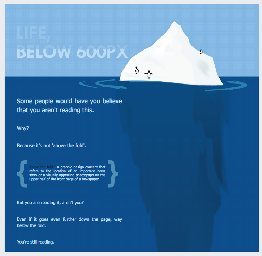
Paddy Donnelly, in Life Below 600px explains how content “above and beyond the fold” really is just the tip. This graphic illustrates the point:
We need to give people a reason for scrolling, given that they do it. We no longer have to fit everything onto a single screen. It is difficult to be creative with vertical space given the number of devices and screen sizes available.
Conclusion
Statistics and research show that digital experiences are changing quickly. This trend is expected to continue as technology advances.
While the fold of tomorrow may be different from what it is today we can move past thinking of it as a unit of measurement. Consider the fold as a concept to capture attention for your compelling user experiences.

Author

Posted by Lets Nurture
Our Partners


